Red and Burgundy.
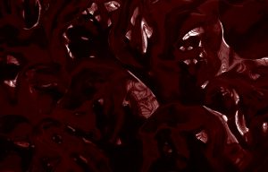
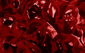
Darker one vs brighter one.
I feel that the red one is more appealing,it is easier to look at, and look for objects in it.
I have been told that most of my photos are too dark, they lack light and it is hard to see them unless the screen brightness is adjusted to maximum.