Mat Collishaw’s website.
So far this is my favorite artist website. I have asked a web designer for his opinion on this website.
His words were – This is a really well made website, well organized, easy to use, and it looks good.
At the moment I am considering to have a similar main menu layout .
I would have a similar color scheme (Black and white with red highlights.)
The mobile layout for this website is just beautiful, it is so well adjusted.
However I have found something that i don’t understand.
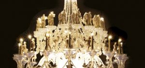
On the main page of this website there is a poorly edited photo. it is the first photo that comes up.
I only noticed because the light settings on my screen were up to maximum as i was editing Photos of my work.
I will ensure all my photos are in best possible quality.